|
Design 101
Creating a garden is much more than choosing plants and deciding where they should go on your property. The ultimate goal of designing a garden is to produce one that is both visually pleasing and functionally in harmony with the site, home, and owner’s lifestyle. In the landscape profession, designers often depend on basic design principles in order to create such a garden. These principles are derived from the fields of art and science and they are:
Unity
Unity is affected by connecting major features on your property both physically and aesthetically. Physical unity is created through permanent elements (such as windows, doors, gate, path, deck) that connect your garden to the house. Aesthetic unity is created by combining styles and features. Some methods for creating unity are:
| • | Physical connections: Windows and doors physically connect your house to the garden, which creates a feeling that the garden is a natural extension of your home. In order to create this natural extension, a house needs to have an adequate number of access points to the outdoors, or else there will be a sense that the garden is a separate and distant entity from the rest of the house. If you need more outdoor access, consider changing a window into a door, changing a single door into double sliding doors, or replacing cabinets, closets, walls, etc., with windows. |
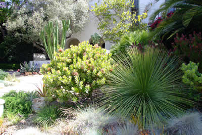
The repeated use of grey green plants helps to unify the garden
composition.
Designer: Suzanne Jett, Jettscapes
| • | Style: Examine your house as well as the outdoor environment for characteristics that are similar in style or ones that you would like to incorporate in the overall design. Pay attention to and incorporate architectural details such as window height, house corner heights, overhang widths, gutters and down spouts, and circulation (paths, steps, stairs). Are there features in the surrounding environment you particularly like or that enhance your property, such as a view (scenery) or a vista (distant hills, mountains) or nearby body of water? Such features can be “framed” to become an attractive element of a garden. |
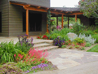
The porch is protected by a deep, overhanging roof,
connecting the home and garden through its rustic
style.
Function
Here, function is thought of as incorporating into the garden design utilities that are necessary for the everyday operation of the household, such as garbage can, storage lockers, tool sheds, woodpile, compost heap, etc. When designing a garden, keep in mind these items so that they are unobtrusive but are easily accessible and that the overall garden is orderly. Some suggestions for assimilating household items into the garden design are:
| • | Garbage can and recycling containers should be located on a level spot, have street access, and be near a hose bib for easy cleanup. Keep them away from any entryways or windows so that bad odors do not permeate into the house. If your garbage can attracts wild or neighborhood animals, then consider building a locking shed to store it in. |
| • | Tool shed or storage locker should be in close proximity to the front or back yards and near the house for easy access. They should be rainproof, lockable, and close to the part of the garden that requires most maintenance. |
| • | Place the woodpile so that it is easily accessible and is protected from rain. Avoid stacking wood against the house, but if you must, make sure to use a plastic tarp to separate the wood from the house. Try to have a dumping ground for the wood where the plants, house exterior, and hardscapes are not going be damaged. Check with your local fire department for fire codes on woodpiles. |
Simplicity
Keep it simple. Less is more. Keeping the design to the fundamentals of your needs and your property creates simplicity in your garden. Design according to your needs and not by whim. The first such fundamental element to consider is your house, because your house is the main feature on your property. So, let your house set the tone for the garden layout and design around features that you find attractive, harmonious, and pleasant.
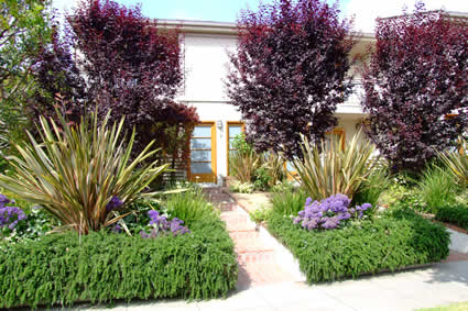
Very few plant types are used here but the simplicity of this layout speaks
for itself.
This way, your garden will accentuate positive features and minimize negative elements of your property. This also prevents the garden from appearing artificial, fussy, and with little logic. A few tips on achieving simplicity:
| • | Use repetition to avoid a fussy, busy design. If you utilize too many plants that are dissimilar, your eye doesn’t know what to rest on and will tire easily. |
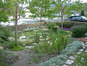
This landscape utilizes many different plant types,
colors, and textures, and building materials, which
creates a busy look.
But occasionally, you can add “spice” by adding a few unique plants. This makes the garden more interesting.
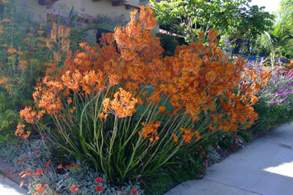
Nothing adds spice to a garden like bold colors.
| • | Consider coordinating colors, textures, and styles of exterior patios, decks, or terraces with inside floorings. Also, think about what you like and what you can afford. Flooring is a big budget item. If matching exact materials is impossible, try to match color, shape, style, and texture as closely as possible. |
| • | Once you’ve decided on the construction materials (such as brick, rock, stones) for paths, walls, steps, or seatings, make that choice your main material for these features. By doing this, the garden elements are “pulled together;” that is, the garden is unified. |
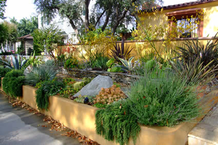
The common raised planter and house color helps to tie the garden together.
Scale (proportion)
Scale refers to the size of elements on your property in relation to each other and to the overall effect of the house and property. Scaling elements provides visual balance. A towering tree, such as an oak tree, might complement a large office building but would dwarf a single story home. In addition to size, there is also variable volume to consider. In a garden where a gazebo in a corner of the garden is surrounded by several shrubs and trees and another corner has only a small ornamental pot enclosed by low perennials, the overall effect is visually unbalanced because of the difference in volume and size between the two areas of the garden.
Scale also means bringing the garden and its features down to the human scale; that is, the garden’s size and height are scaled in relation to the human body. For instance, do not build a fence or wall that is at eye level, because the eye would generally follow the top line of the structure, which makes it a dominant feature to the human eye and takes the attention away from the rest of the garden. This is also true if you plant a shrub next to the house that obscures windows and doors at maturity. The plant’s mass/volume is out of scale with the house.
Follow these rules of thumb to get a handle on scale.
| • | Design around one dominant feature such as a tree, bench, or sculpture. All other features should be subordinate (smaller scale) to this element. For example, a small flowering tree is the right proportion for a small private patio. |
| • | Choose your favorite plant and design the rest of the area in coordination with that main plant’s size, leaf size, color, etc. This strategy helps to unify the garden and keep the garden in proportion. |
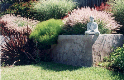
The sculpture dominates the garden, which is where the eye
focuses. The plant’s softly colored, airy shapes provide a calm
setting for it and add balance to the rough texture of the garden wall.
| • | When planning for paved surfaces at entry courts, terraces, or decks, design them according to your needs and purpose. When in doubt, large and wide pathways and other hard surfaces are better than undersized ones. Many homeowners often make the mistake of scaling them too small for fear of having the structure be too dominant to the overall garden. However, the eye will more readily detect an element that is too small for its area than one that is oversized. Surfaces lend simplicity to the garden that is pleasing to the eye, are low maintenance, and can be toned down (softened) with plants. |
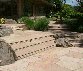
The wide, flag stone steps and patio permits side-
by-side strolling, a sense of welcome, and safety.
| • | When planning for a path, consider the purpose of the path and where it is going to go. For a path where guests will be walking, it should be at least 5 feet wide so that two people can walk side by side comfortably. A side yard path or ones that connect the front and back yard can be narrower because they are mostly used for utility, such as moving a wheelbarrow, hauling debris, or just to move from one point of the garden to another. |
| • | Don’t be afraid to be bold. However, keep it simple - choose a bold color or size, but build on that color or size scheme and avoid offering too much variety. One or two large potted plants are more restful to the eye than many small pots. |
Apartment Building Example
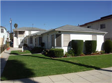
Before
Photo by Patrick Davies
|
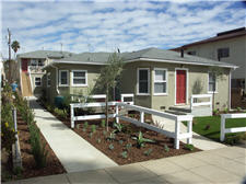
One week after installation
Photo by Patrick Davies
|
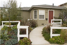
Two years after installation
Photo by Amy Williams
|
Single Family Home Example
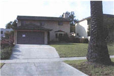
Before
Photo by Peter Jensen Photography
|
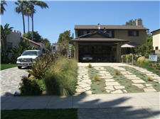
One week after installation
Photo by City of Santa Monica
|
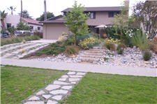
Six months after installation
Photo by Deidra Walpole
|
School Example
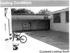
Before
Photo by Edison Academy
|
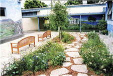
One month after installation
Photo by Grace Philips
|
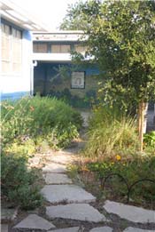
Two years after installation
Photo Deidra Walpole
|
|
